Ready to see a behind the scenes look at a real client’s branding revision process?
I thought so 😊
No matter what we’re creating together, giving my clients a way to share their feedback and changes on a design project in a collaborative way is, in my opinion, crucial.
While I bring the design and strategy skills to our projects, my clients bring knowledge of their business and a deep understanding of their industry. ALL of these things are needed to create a brand (or website) that will create an impact and work for you.
When it comes to my branding process, I always leave room for revisions, while at the same time doing a lot of up front work and check ins to make sure we’re on the right track and never too far off-base. And this approach hasn’t led me astray yet. The up front work and check-ins include:
- A client questionnaire that has them answer everything I need to know about their business—from why they started, to their short- and long-term goals, audience, competition, visual preferences, and more.
- A creative direction phase where I pull out the most important elements of the brand (for example, the kind of audience they want to attract) and brainstorm how that can come to life visually (for example, through a certain color palette or style of font).
- Frequent review calls to make sure we’re on the same page every step of the way, and pivot as needed.
And I’ll be honest: sometimes I send a branding presentation through to a client and there are ZERO changes. They say “OMG I LOVE IT!” and we’re done. And other times, there are parts that need to be tweaked, or changed in a bigger way.
Both of these scenarios are a-okay & both are totally normal.
Now that I’ve given a bit more context into my process and approach, I’m going to share a branding project I worked on last year, along with the feedback and revisions process — and also show how the client’s insight and changes made for an even better end result.
Introducing: babe + bud – a children’s banner & pretend play company run by Andria, a passionate solopreneur based in California.
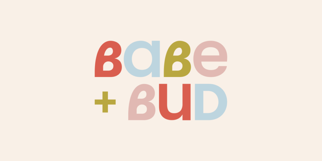
After going through my Brand Strategy & Creative Direction process, I went ahead and created Round 1 of Babe + Bud’s visual branding. And the thing I was most excited to present was the double (or triple) meaning behind the custom Bs in the business name:
They were not only Bs but also hearts, which was a nod at the love parents have for their children in raising them. AND when flipped and put together, they became a flower, which signified the growth and flourishing children go through as they grow up and learn.
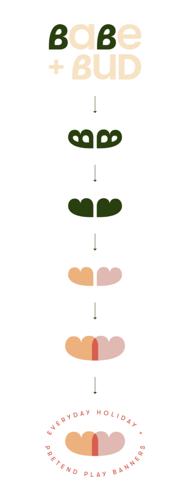
I love a double meaning in a logo, even if it’s a bit more hidden, so I thought this solution was genius.
Meanwhile, the thing Andria loved the least was the Bs 😂
(Andria, by the way, was awesome to work with. That’s why this blog post is so easy to transparently write. None of this feedback was taken personally, and it all made the end result way better).
With branding projects, I always give clients a few days to sit with the presentation and compile their thoughts, feedback, and edits before we get on a review call. Here was the feedback for the initial take on Babe + Bud:
1. THE LOGO
She didn’t love the custom Bs in the logo. She showed it to some friends, who didn’t really “get it” or see the double meaning, rendering it useless. Overall, it felt a bit too bold for a brand that we wanted to feel fun and welcoming.

2. THE COLOR PALETTE
The color palette was working for the most part, save for a few edits. The dark green wasn’t working for her. We talked about scaling back on the number of colors. We particularly wanted to make sure this appealed to adults more than children, since they’re the main audience purchasing Babe + Bud’s products.
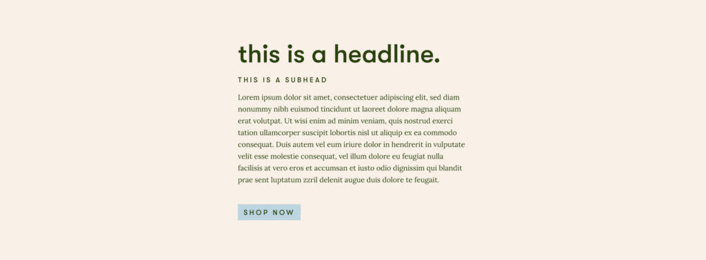
3. THE FONT SYSTEM / TYPOGRAPHY
Loved how the typography felt clean and modern, and asked to try to incorporate a handdrawn cursive element, maybe as a tagline.
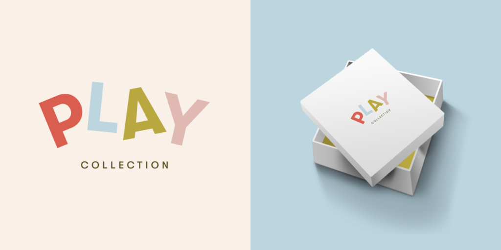
4. the PLAY collection sublogo
Loved the PLAY Collection sub-logo! No changes, except to make sure it still matched wherever we landed for the new logo. (For example, if we changed the font of the logo, we’d also have to change the font of the PLAY Collection.)
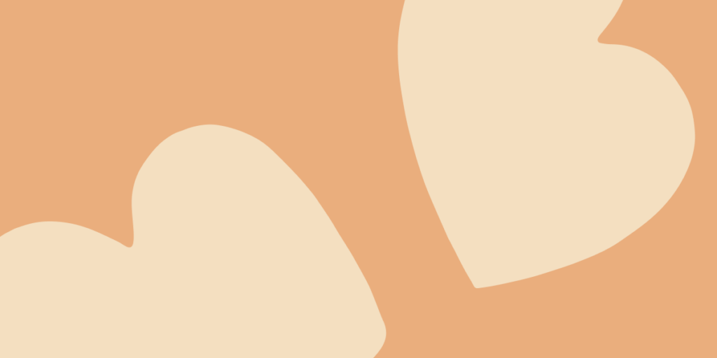
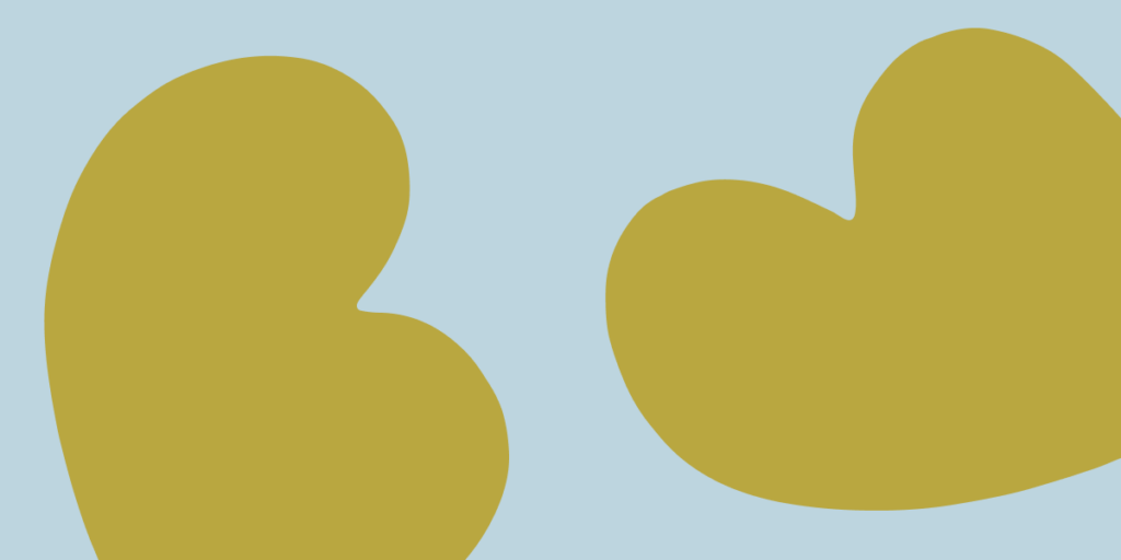
5. The graphic elements / patterns
The graphic elements/patterns utilized the Bs, which we were getting rid of. She also thought they felt a little too retro, and together we brainstormed trying handdrawn elements like polka dots, stripes, and confetti instead.

6. The icons / illustrations
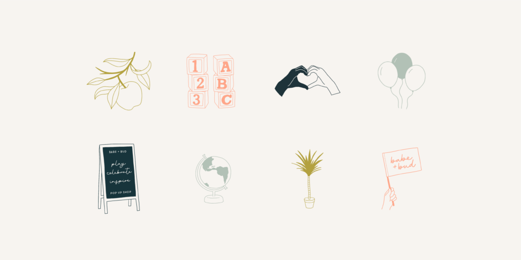
She loved the illustrations and had a lot of use cases for these, so we decided to expand on the library.
So what happens next?
This might seem like a lot of feedback, but so much of it was intertwined and related to each other. After our review call, the biggest thing I felt I had to do was revisit the logo. And once we got the logo right, the rest of the pieces fell into place.
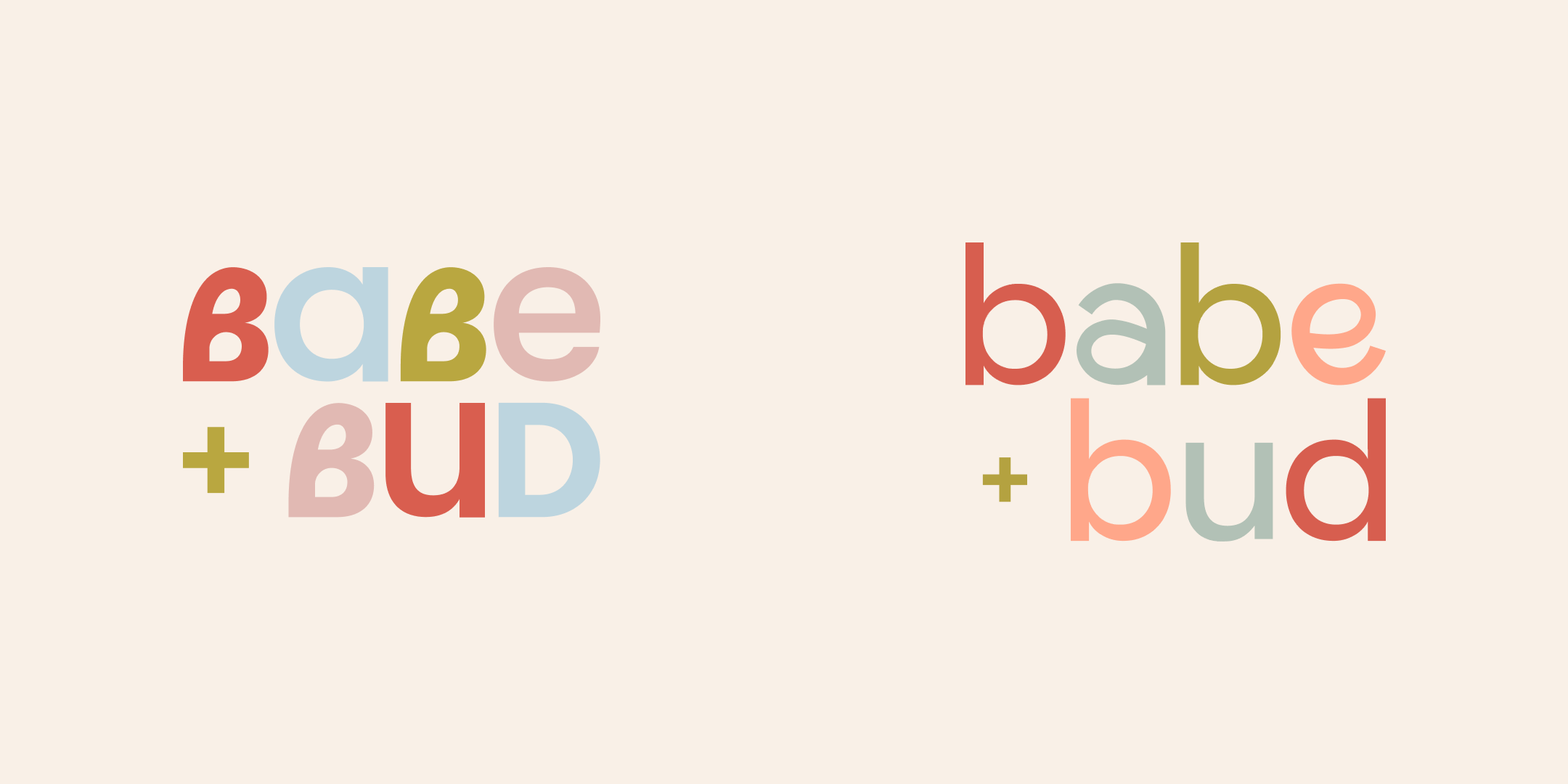
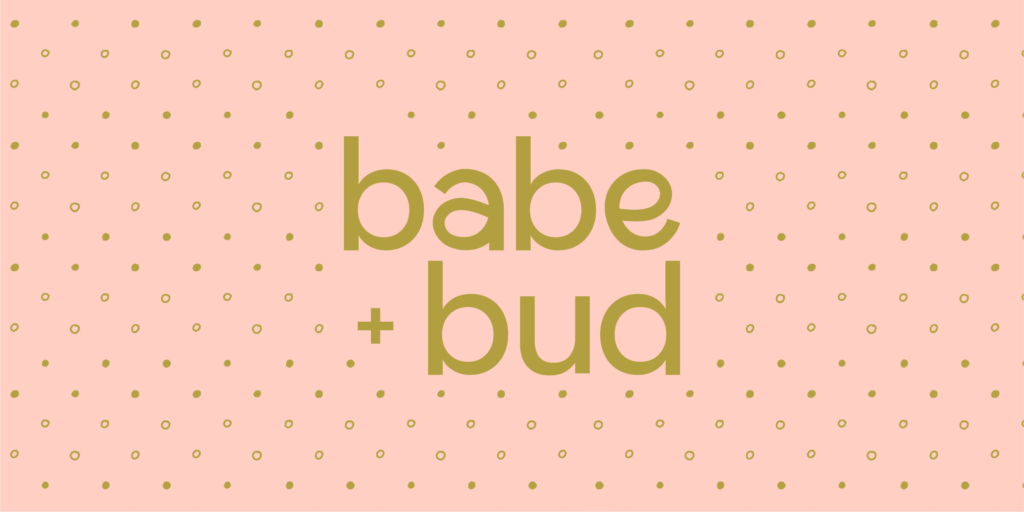
For the logo, I ended up sticking with the same font, which I felt was working, but using a weight that was less bold. Conceptually, I still wanted it to feel custom—in a subtle way—and aligned with the brand attributes of fun and celebratory. After lots of sketching, I realized a loopy “a” was basically the same shape as “e,” just upside down… and this made for a really fun new logo concept:

We also explored an option where “BUD” was all caps. The idea here was that kids grow up—and having the letters go from lowercase to uppercase showed that growth. Ultimately, my client decided for the simplicity of the all lowercase:

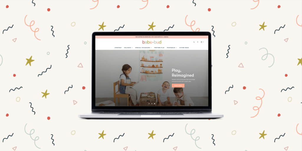
And like I said—once we got the logo right, everything else fell into place:
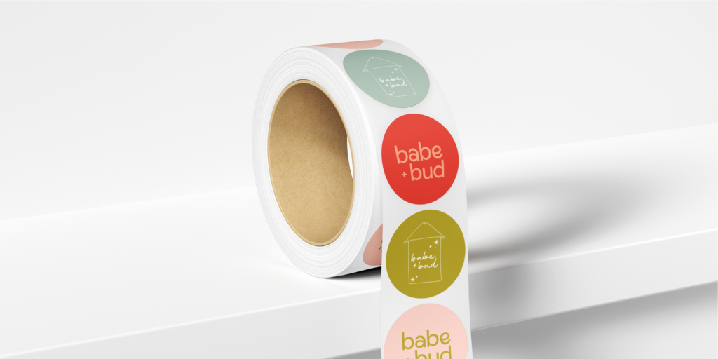
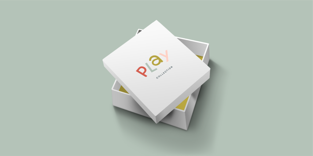
(You can see the full portfolio piece here & their live Shopify site that we worked on together here!)
Ultimately, I can’t imagine Babe + Bud’s branding any other way, and we were both so stoked about the end result. The above revision process is a real testament to how important collaboration is.
Have any other questions about how my branding process typically works, or wondering if it’s the right time for you to revisit your brand? Leave me a note below!
...at least I'm trying to make it that way. While I'm off Instagram, I'd love to hear from you in other ways! Fill out the form below with your thoughts or questions on the blog post!
Did ya hear? Website contact forms are the new Instagram DMs.
i'll write you back soon :)
Thank you so much for sending me your thoughts!