


When you’re building a brand that really connects with your audience, color is more than just a design decision—it’s a strategic one. While your logo might only pop up in a few places, your brand colors are going to be everywhere—from your website and packaging to your Instagram grid and email graphics.
Color plays a huge role in how people perceive your brand. It can build trust, set the tone, and create that instant “vibe check” when someone first comes across your business. That’s because color impacts us emotionally and even physically—often without us even realizing it.
Different colors tap into different emotions. For example, green is commonly associated with nature and growth, while blue is often linked to calm, trust, and professionalism. When you choose colors that align with the mood and message you want your brand to communicate, you’re giving your audience a more cohesive, memorable experience—and one they’re more likely to feel connected to.
On top of that emotional impact, color can also influence behavior. Studies show that people form opinions about products or brands within just seconds, and color is a major part of that snap judgment.
In this color psychology series, I break down one color at a time to help you better understand what each one communicates—so you can make more intentional choices as you build out your brand palette.
Today, we’re diving into the color blue.
Blue is one of the most universally loved colors—and it’s not hard to see why. It’s the color of the sky, the ocean, and that sense of steady calm we all crave from time to time.
Positive associations with blue:
- Trust
- Calm
- Clarity
- Stability
- Confidence
- Professionalism
- Communication
Depending on the shade, blue can also feel a little distant or overly corporate—so you’ll want to think about the tone you’re setting overall.
Potential negative associations:
- Coldness
- Sadness
- Aloofness
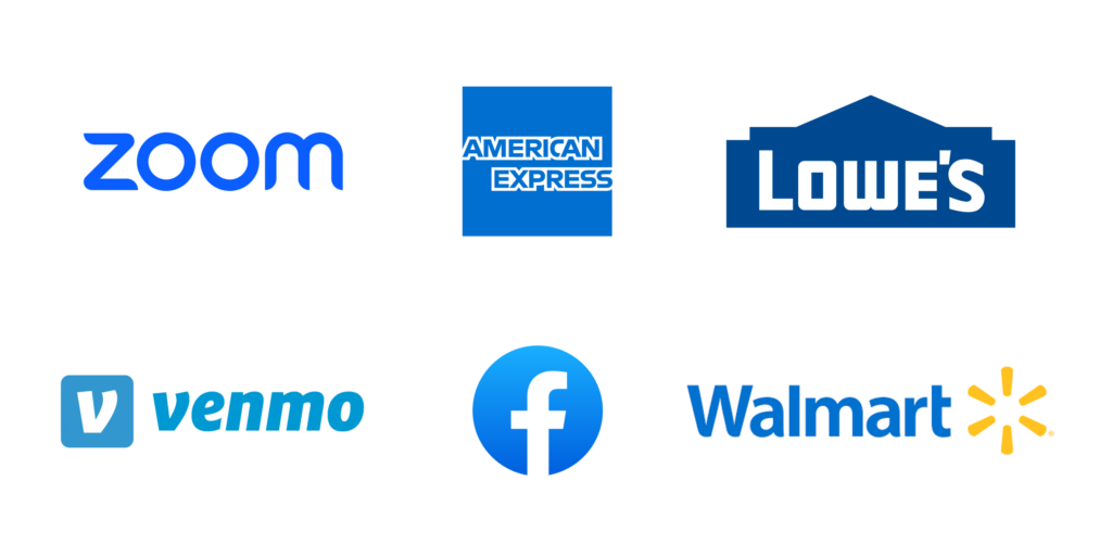
Brands that use blue:
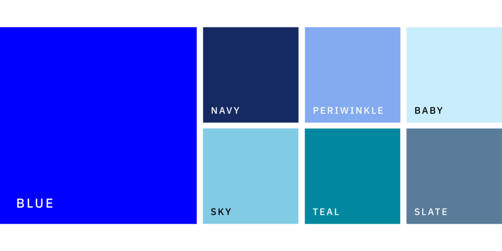
Shades of blue to explore:
Whether you’re going for calming and collected or bold and trustworthy, blue is a color that can work beautifully across a wide range of brand vibes. The key is choosing the right shades and pairing them with complementary colors to get the effect you want.
Color psychology is such a useful tool for building a brand that connects, converts, and truly reflects what you’re all about. When your colors align with your values and audience, it can make all the difference in how your brand is seen—and remembered.
Curious about what colors are right for your brand?
I’d love to help you figure it out. Fill out the form below or email me at hello@craftedbycarly.com and let’s chat branding!
...at least I'm trying to make it that way. While I'm off Instagram, I'd love to hear from you in other ways! Fill out the form below with your thoughts or questions on the blog post!
Did ya hear? Website contact forms are the new Instagram DMs.
i'll write you back soon :)
Thank you so much for sending me your thoughts!