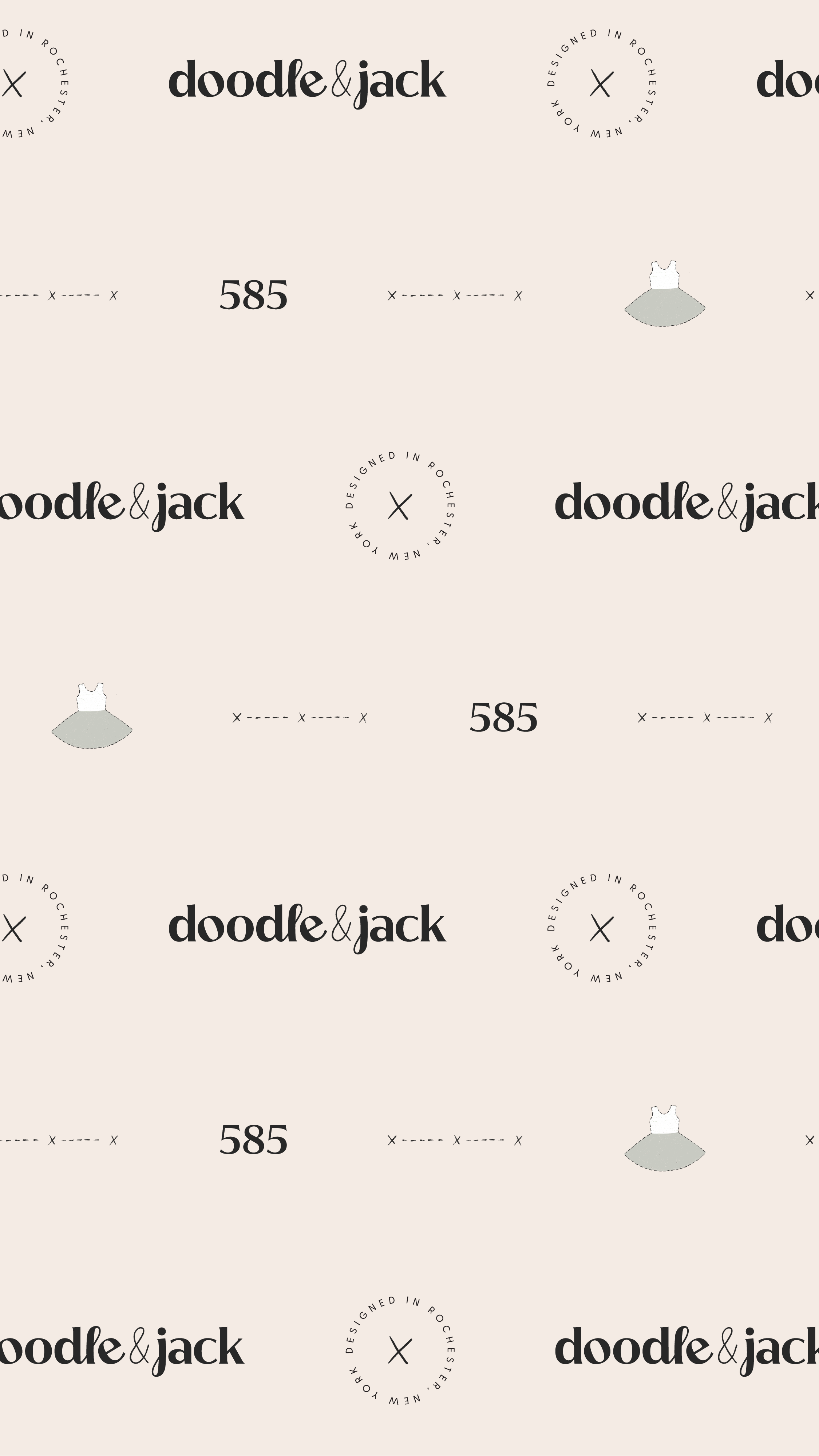
Have you ever walked into a brick & mortar storefront because of what it looks like on the outside? Bought something on a website because the messaging resonated with you, and the overall experience of shopping felt so smooth?
My guess is yes (I know I have!) and from the shop owner’s perspective, that wasn’t an accident. Instead, that was strategic branding at work.
Last year I had the opportunity to create the brand strategy & branding for doodle & jack, which is a Rochester-based baby boutique specializing in handmade clothing & accessories. Our overarching goal, of course, was to grow the business by creating a brand that felt irresistable. Whether you were a potential new customer walking by their new storefront in town or stumbled upon their website; or whether you had already been shopping there, we wanted the brand strategy to give doodle & jack a blueprint for how to continue building a successful brand, and we wanted the visual branding to reinforce that strategy and their values.
And let me just say—I am SO thrilled with how it came out. Read on to get a behind the scenes peek at the Crafted by Carly brand strategy & branding process to see where we landed with this incredible brand!
Step 1: Learning everything there is to know about doodle&jack
First thing’s first: at the beginning of every branding project, the first thing I need to do is learn everything there is to know about the business at hand. I do this by sending an in-depth questionnaire to the client before our project starts, and then we kick things off with a Zoom call where we talk through everything, ask questions, and start to brainstorm and bounce ideas off of each other depending on what comes up.
For doodle & jack, their co-founder Danielle explained to me that she and her sister-in-law started the company when they each had their first baby because Danielle couldn’t find leggings that had a comfortable waistband for her daughter’s little buddha belly. She taught herself to sew to solve this problem, and after they perfected the leggings they continued creating new custom clothing: shorties, skirts, headbands, and more.
Right then & there I knew we had something special: these clothes are not only handmade with so much love, but they will also make completely custom sizes if your baby needs it. How cool!
During this kickoff call we talked about SO many other things that came up in the questionnaire too, including:
- Where the business was and where they wanted it to go → At the time we started the project, they had been mostly selling online but had a storefront that they wanted to put more emphasis on. They also wanted to continue expanding their wholesale program.
- Why their current customers love buying from them → They feel cared for because doodle & jack happily creates custom in-between sizes or will take custom requests for events like birthday parties.
- Who their audience is and who they want to attract → Mothers with young kids who care about quality and like to shop small. Moving forward they also wanted to attract more local moms to their new storefront.
- And so much more, including the obstacles they were currently facing, competitors, brands that inspired them, and visual preferences.
Step 2: Brand strategy
Once I learned everything there was to know about doodle & jack, it was time to move onto the brand strategy part of the project. I like to think of brand strategy as the blueprint of your brand: it keeps you on track so that you can be confident that you’re ALWAYS showing up on-brand, and not just in the visual way. In fact, brand strategy is about so much more than just the visuals.
When you strategically outline your vision & mission, core values, goals, differentiating factors, audience, the problems you’re solving, the benefits of your offer (& so much more), you’re able to stop spinning your wheels and make decisions in so many areas of your business that actually serve you so that you can grow with more confidence and ease.
When you have a brand strategy, it becomes easier to stay on brand so that you can successfully:
- Write copy for your website (or give the brand strategy to a copywriter and have them write copy for your website)
- Market yourself, whether it’s via email, social media, paid ads, blogging, etc.
- Create a client / customer experience that makes sense for your business (and as a result keeps them happy and coming back for more)
- Create new products / offers that are in-line with your core values, future goals, and what your audience wants or needs
- & so. much. more. (I’m thinking I need to do a whole other post on this subject!)
As a recap, the brand strategy that we put together for doodle & jack included the following:
- Vision & mission
- Core values
- Goals
- Competition
- Unique selling points & other differentiating factors
- Audience & brand persona
- The problems you’re solving
- The benefits of your service / product
- & more
Step 3: Creative direction
As you might’ve noticed, the brand strategy doesn’t have that much to do with visual branding. It is, however, an essential piece of the decision-making process when we start to ask the question: So what should this branding LOOK like?
Which is why we use the brand strategy to guide the next phase of the process, which is creative direction. Creative direction is when we start to brainstorm and source inspiration about the visuals. We don’t actually create any visuals yet, because we want to make sure the client is on board with all of our ideas before getting into any of the time intensive work.
There are 3 key parts of the creative direction that help bridge the gap between the brand strategy & the visual branding:
The first is the brand positioning statement. Here’s what it was for doodle & jack:
Doodle & jack offers handmade and custom designed baby clothes & accessories for moms across the U.S. with little ones NB-4 years old. You stand apart through your passion for creating comfortable, custom clothing that’s timeless, modern, and high quality. You seek to provide baby clothing & accessories to your customers that stand apart from the rest. You promise that each pair of clothing is handmade with love with comfort top of mind. All of these things have been taken into consideration for your creative direction.
The second is a series of buzzwords that help guide the aesthetic direction. These are descriptive words that came up a lot throughout the strategy process, or maybe that I came up with after the fact that I think to embody the brand.
For doodle & jack, the words were: modern, playful, quality, unique, young, custom, neutral, natural, and handmade.
The last is the moodboard. This is exactly what the moodboard looks like in the Crafted by Carly Creative Direction presentation:
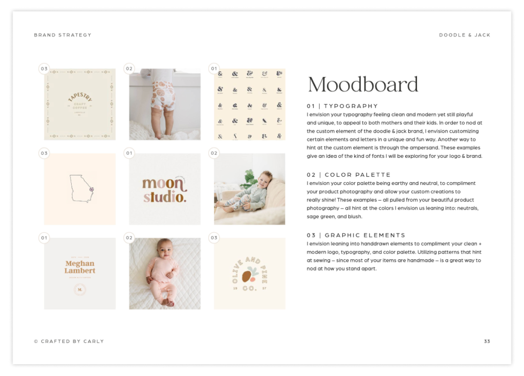
As you can see, some of the things I proposed for doodle & jack were…
- Typography that felt clean and modern yet still playful and unique, to appeal to both mothers and their kids.
- A color palette that was earthy and neutral, to compliment d&j’s product photography and allow their handmade products to really shine.
- Leaning into handdrawn elements to compliment the clean + modern logo, typography, and color palette.
- Utilizing patterns that hint at sewing – since most of your items are handmade – is a great way to nod at how you stand apart.
After presenting the strategy & creative direction Danielle & I hopped on a Zoom call to talk through her feedback and any changes we wanted to make. In this case, there were really minimal changes! Everything in the strategy felt aligned, and the description of the moodboard elements felt spot on. The one thing we spoke about was how some of the ampersands in the moodboard were a bit too bubbly for the brand, so I made sure to keep that in mind when moving into the visual branding phase.
Step 4: Visual branding
As you can see, there’s a TON of work that goes into the beginning of the project before we even get into design! And this is in part to make sure we’re set up for success, so that I have a clear view of what your business is all about, where you’re taking it in the future, and any visual ideas or preferences you may have.
Once I start the visual branding process, I am playing around with various elements in tandem — which means lots of messy design files and switching back and forth between font options, color palettes, logo layouts, and more.
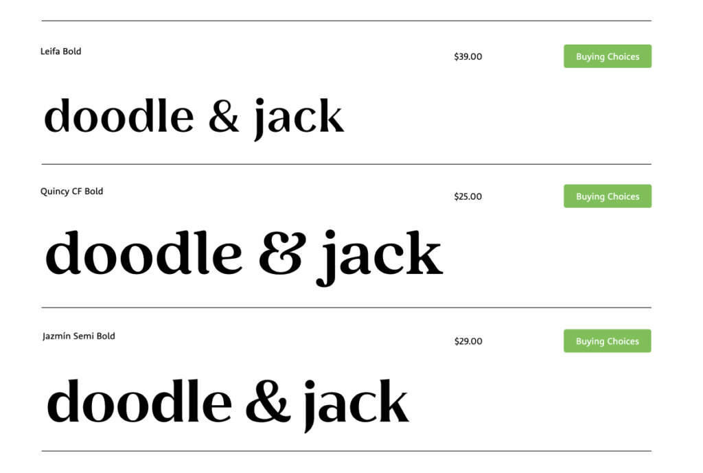
For doodle & jack, I explored a few different font options that teetered the line between modern and a bit playful. I begin by taking screenshots of my favorites – this is so that I can see what they look like before having to purchase any font licenses. Here are a few that I was into for doodle & jack:
Once I had a good idea of what font was my favorite, I knew I wanted to play around with the layout of the letters to get at the playful component of the brand. As you’ll see… I did quite a bit exploring of ideas that DIDN’T work right away:
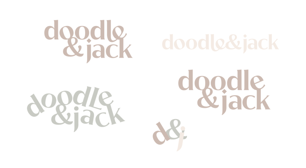
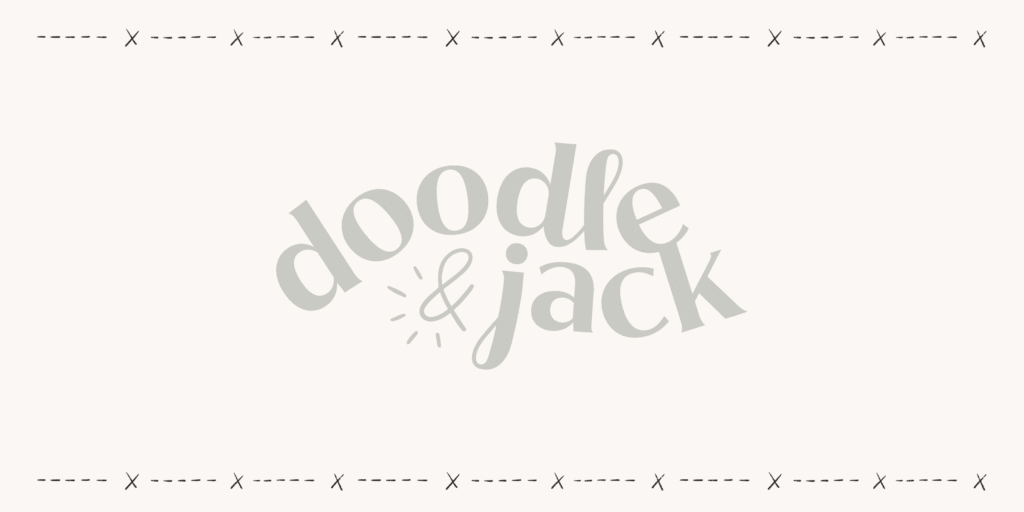
But ultimately, all these options served their purpose: to get a lot closer to the final logo, which just felt right. Between the spacing of the letters, the added handdrawn ampersand, and the fact that the “j” and the “l” were the same, just upside down(!), I knew we had a winner:
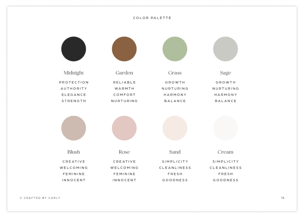
For the color palette, we kept things mostly neutral and earthy, but also added in some dusty pinks to nod at the creative, welcoming element of the brand:
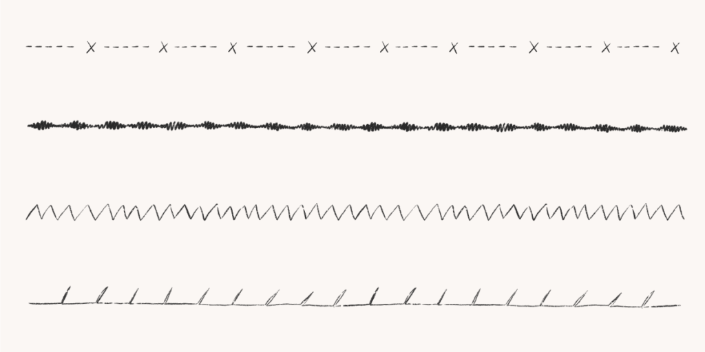
And for the illustrations and patterns, everything was handdrawn – with lots of references to sewing. Some of the background elements include handdrawn sewing stitching to use as borders:
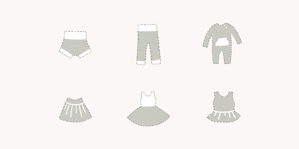
And the illustration style, which I personally loooove, uses a dashed line to nod at the fact that they sew all of their own products:
Step 5: Revision process
When I send through a branding presentation to a client, I give them a set of questions to help guide the feedback discussion. I always say that these questions shouldn’t LIMIT them… they should tell me any & all of their thoughts & feedback… but it does help pinpoint what they’re loving or not loving about different aspects of the brand.
The questions are:
- Which parts of these designs are you excited to see?
- Are there any parts of the concept you’d like to see done in a different way?
- Do you feel like the concept will resonate with your target audience? Why or why not?
- Are there any aspects of the concept that you feel are on the right track, but you’d like to see explored further?
- Do you feel confident enough to keep moving forward?
Danielle and I hopped on a call, and in her case, there were a few small things. We tweaked some of the language on the taglines and the copy on the submarks, and she asked for a few more specific illustrations to add to the illustration library. Overall, this process is usually very smooth because of all the work we do upfront to make sure we’re creating something that is strategic and in line with the client’s vision!
Step 6: Brand guidelines
Last but certainly not least, once everything was all approved, I sent Danielle doodle & jack’s Brand Guidelines. The Brand Guidelines are a 35+ page PDF outlining how to use the brand—from the logos, colors, fonts, and patterns. It’s a great document to share with anyone you have working on your brand, whether it’s a VA scheduling an email in Flodesk, a designer creating social media graphics, a printer printing signage for your store, or even a copywriter so that they can see the kind of visual branding their words will live amongst.
Overall, Danielle’s final words say it all:
“When I came to Carly, our brand didn’t feel cohesive. I felt like our old logo didn’t grab our customer’s attention and there was no clarity around the rest of the branding, like our colors or fonts. Carly took the time to listen to my goals and vision and I love the overall outcome! Not only do I have more confidence running ads on social media, but we’ve noticed an increase in sales thanks to that marketing and our beautiful new branding and website. I absolutely recommended working with Carly—I felt really heard about what I wanted and everything turned out amazing.”
I hope this post helped to shed some light on the creative process and how we came to certain decisions! This brand was SUCH a fun one to work on.
Are you feeling like your brand is all over the place and are ready to revamp it so that you can feel professional and grow your business (like Danielle did)? Send me an email at hello@craftedbycarly or inquire about our services HERE!
...at least I'm trying to make it that way. While I'm off Instagram, I'd love to hear from you in other ways! Fill out the form below with your thoughts or questions on the blog post!
Did ya hear? Website contact forms are the new Instagram DMs.
i'll write you back soon :)
Thank you so much for sending me your thoughts!