When it comes to your branding, the work doesn’t end when your designer sends over your new snazzy logos, branding files, and style guide. To the contrary: the work is just beginning!
Unfortunately, too often I see small business owners who have gorgeous branding (whether they worked with me or someone else) BUT… they’re not actually using it in a way that feels cohesive or professional.
While I admit it’s a bit uncomfy for me to tackle this topic, I think it’s SO important as a brand designer for me to share some of the biggest mistakes I see fellow entrepreneurs make when it comes to their branding. Why? Because if you can fix these mistakes, you’ll be able to actually start reaping the benefits of your branding, including:
- Looking professional + legit, and therefore building credibility + trust among current and potential clients.
- Having not just a cohesive visual brand but also a cohesive message and overall experience, which will help you attract your dream clients, foster brand loyalty among previous clients, and encourage word of mouth marketing.
- Feeling confident that you are showing up in a way that’s authentic to you – which in turn helps you to show up consistently in your marketing efforts.
- Becoming recognizable across all the platforms you show up — whether it’s your website, Instagram, paid ads, storefront, etc.
- & so. much. more.
So without further ado, read on for the 4 biggest mistakes I see small business owners make when it comes to their branding, and how I recommend fixing them!
From a high level, there are 2 mistakes I see happen a lot right out of the gate – meaning you get your final branding and brand style guide from your designer, and then this happens…
MISTAKE #1
You try to DIY it all
When you first brand (or rebrand) yourself, your first task is to make sure you implement your new branding across your business. This includes:
- Your website
- Social media posts
- Paid ads
- Lead magnets
- Digital offers like masterclasses or courses
- Packaging, like boxes, tissue paper, etc. for physical products
- Signage if you have a brick & mortar storefront
- & more
And after spending time & money investing in your branding, it may feel tempting to do allll of the above by yourself. The problem is that this is a LOT of design work – and it requires having a pretty deep understanding of design principles, such as typography, spacing, and color usage. So what ends up happening is your deliverables don’t look as snazzy or professional as your new branding does… because things like type size, font hierarchy, spacing, and color usage is off.
THE SOLUTION
Depending on your budget and needs, there are 2 options – all of which will pay dividends in helping you to grow your brand in a successful way:
The first option is to hire your brand designer to establish a set of templates for you to work with.
Lucky for us, Canva has made design work feel really accessible, and if you have templates to work with, not only will you be able to use your branding in a way that looks professional, but it’ll also take a lot of the guesswork out of the process and save you a lot of time. When I work with a branding client, I always ask them at the beginning of our project what sort of deliverables they need on a regular basis to market or run their business. Some of the most common things to create templates for are:
- Social media posts, including Instagram Stories and grid posts, Reel covers, and Story highlight covers
- Blog post headers
- Email newsletters
- Card inserts for physical product packaging
The second option is to hire a designer on retainer, so that you have a professional “on call” to do your ongoing design work for you.
If you don’t even want to have to think about doing DIY design work, and instead want to stay focused in your zone of genius, a design retainer might be the right option for you. A design retainer is when you have access to a designer on an ongoing basis to tackle all of your design needs. Different designers set up their retainer packages in different ways, but here at Crafted by Carly it typically works like this:
- The business owner commits to a set amount of hours per month. This can be as low as 5 hours/month up to 40 or more hours/month. Depending on the amount of hours you need, you’ll get priority rates that are less than my usual rates.
- You make your design requests on an ongoing basis. Common requests include sales page design, social media posts, email design, blog post headers, course content, slide decks, and SO much more. Because you have me on retainer, you get priority service and I turn things around much quicker than I’m able to for other clients who have to be slotted into my calendar. This can be as quick as just 2 days!
- You have a consistent brand and can focus on working in your zone of genius, instead of fiddling around in Canva. Win-win!
For me, there’s nothing more I love than being able to continue working with a client to actually bring their brand to life and watch it grow over time in this way!
The bottom line
Whether you’re looking for a few templates so that you have the tools to DIY it or you want professional ongoing support, make sure you’re getting the right support to implement your new branding in a way that looks professional!
MISTAKE #2
You’re hiring people to help, but they’re the wrong type of professionals for the job
I’m going to be brutally honest and drop a bit of a truth bomb: your web developer shouldn’t be designing your website, and your VA shouldn’t be creating social media templates from scratch.
Unfortunately I see this happen A LOT and it’s always sort of a bummer. That’s like if someone hired me, a professional designer, to do something like SEO or hashtag research…
Just because I’ve learned about those things and explored them within my own business, does not make me qualified to offer those services at a professional level… and the quality I’d be able to provide in SEO or hashtag research would not even compare to hiring professionals.
THE SOLUTION
Work with a professional designer on the big stuff (such as your website). This may require investing a bit more time and money up front, but I promise you you’ll actually be SAVING time & money in the long run by doing it right the first time, and by having a website that is working for you.
Because I know working on your website can be a big investment, I’ve built out a variety of tailored web design services depending on your needs, goals, and budget as a business owner, including:
- Custom web design
- Done-for-you semi-custom web design for service-based business owners
- Do-it-yourself semi-custom web design for service-based business owners (coming soon!)
- Done-for-you semi-custom Shopify sites for e-commerce businesses (coming soon!)
Pssst – want to chat through these options to see which is best for you? Reach out here or email me at hello@craftedbycarly.com!
Now that we’ve talked about the bigger initial mistake that I usually see right after a rebrand, there are 2 more mistakes I see a lot with the ongoing deliverables we all have to keep up with when it comes to building & maintaining a successful brand.
MISTAKE #3
Disregarding design principles & “rules,” including:
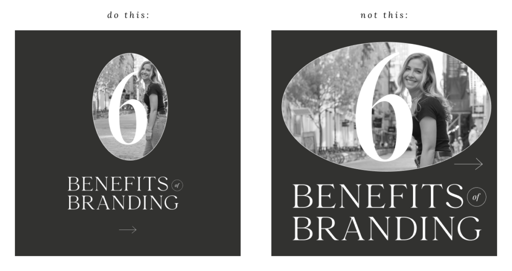
Lack of white space
White space, or any blank space (whether it’s white or any other color), is SUCH an important way to keep information digestible and aesthetically appealing. When we design something without leaving room in the margins, or try to fill every blank space with a brand mark or logo, it makes it hard for the viewer to know where to look. For example:

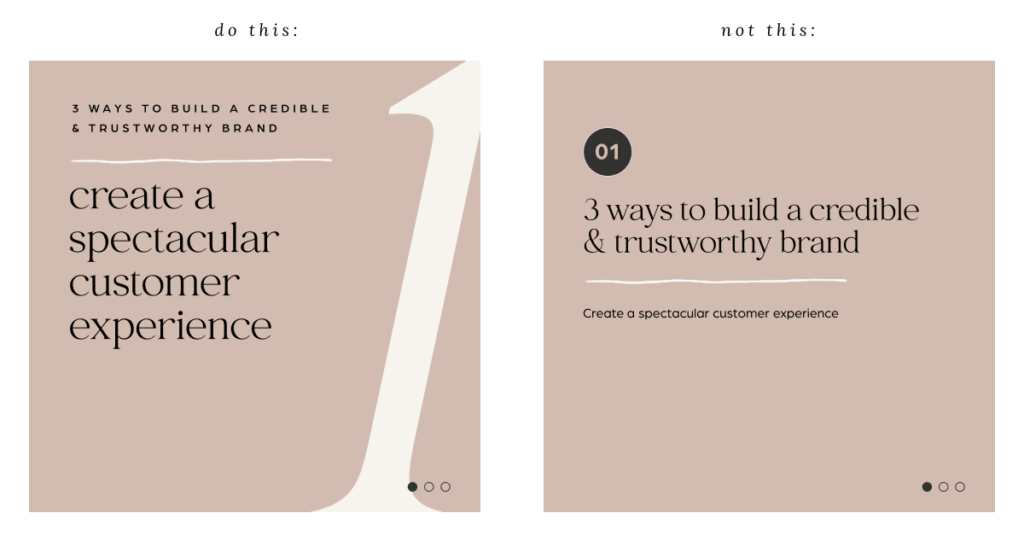
No text hierarchy
When it comes to your brand font system, you should have fonts and styles for your headlines, subheads, body copy, and call to action buttons, and generally speaking, you should always stick to these rules. There are, of course, times when the rules can be broken, but if you’re not a designer and you’re DIYing something for your business, sticking to the rules is a much safer bet. For example:

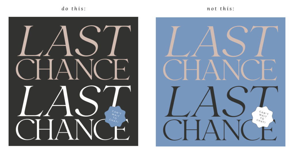
Improper color usage
How to use your color palette may be tricky. When I work with my clients on their branding, I usually give them between 5-8 colors. But not all of those colors are primary colors, and not all of them need to be used all at the same time. Be conscious of the way you’re using your brand colors and when in doubt, ask a designer! For example:

And last but not least:
MISTAKE #4
Not following your Brand Guidelines OR adding to it in a way that’s not strategic
When we finish your branding project, I leave you with a Brand Guidelines PDF that outlines your logos, colors, font system, and more, with the idea being that you should use this as your brand’s source of truth to ensure that you’re always showing up consistently. Buuuut sometimes I know it’s tempting to throw in a new color or change up your fonts.
While your brand IS meant to evolve and grow with you, and there’s totally room to make tweaks over time, it should always be super intentional and something that you can carry through to the rest of your brand. My recommendation is to follow your brand guidelines to a T for at least a few months, and if you find that you’re missing something or are feeling tempted to add a color or a font, reach back out to your designer to help do so strategically.
And there we have it!
When you avoid these 4 mistakes, you’ll be able to build a brand that is cohesive, looks professional, and helps your business to grow.
Think you might be making one of these mistakes & not even sure where to start when it comes to getting back on track?
I’d love to offer you a FREE Brand & Website Audit where we chat through some tangible tips to improve your online presence—and avoid these mistakes. Fill out the form on this page to request a free audit, and I’ll get back to you within 2 business days to book your spot!
...at least I'm trying to make it that way. While I'm off Instagram, I'd love to hear from you in other ways! Fill out the form below with your thoughts or questions on the blog post!
Did ya hear? Website contact forms are the new Instagram DMs.
i'll write you back soon :)
Thank you so much for sending me your thoughts!