Ah London—I love you & your beautifully-branded-everything. This past August, while moseying around Europe for the month, we stopped in London for a week. Having only been there once before (which was in the winter), I was surprised by how much more I fell in love with it the second time around.
I’m a city gal at heart so I loved the convenience of it. I loved that I was able to catch up with some friends there. On the one tour I was able to squeeze in during an otherwise busy work week, I loved learning more about the history of the city.
And I loved that, although I was busy working, I still had to feed myself—and finding food felt like a great experience in & of itself everytime I walked into a new restaurant or café…
Because the branding was always so on point.
So without further ado, here are 3 places I ate at in London whose branding I loved—and whose branding surely nudged me to spend just a teensy bit more money.

1. Dishoom
The branding feels: Nostalgic & traditional
Dishoom is a popular Indian restaurant with multiple locations across London, and I’m not exaggerating when I say I think of their house black daal dish on a weekly basis. The food is absolutely incredible (and according to friends, utilizes authentic ingredients that you typically can’t even get outside of India, but I digress…).
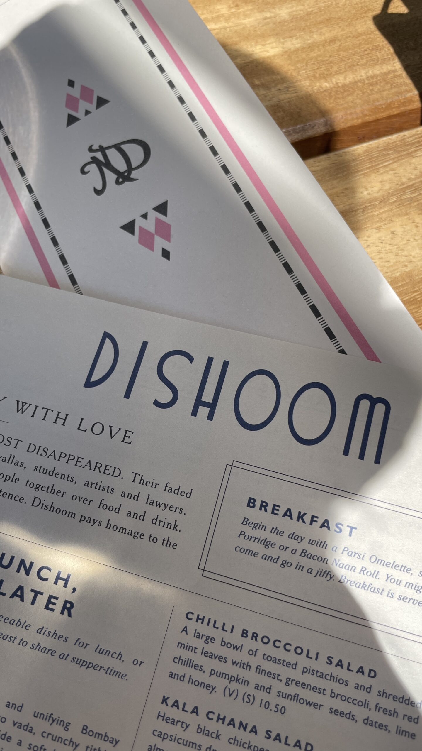
Alongside the incredible food, their branding—from the menu design to the interior decor—created an atmosphere that made me go back twice in 5 days, and made it well worth it for us to wait in an hour-long line to get a table on a hopping Friday night.
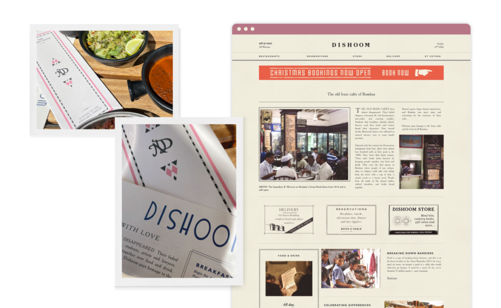
So what drew me in? Other than the many word of mouth recommendations, Dishoom immediately shares their story at the top of their menu (and on the top of their website):
“The old Irani Cafés have almost disappeared. Their faded elegance welcomed all: rich businessmen, taxi-wallas and courting couples […]
Opened early last century by Zoroastrian immigrants from Iran, there were almost four hundred cafés at their peak in the 1960s. Now, fewer than thirty remain. These cafés broke down barriers by bringing people together over food and drink […]
Dishoom pays homage to the Irani cafés and the food of all Bombay.”
Immediately, right there, you feel welcome to partake in an old tradition, even if it’s a tradition you weren’t previously familiar with. You see how food has the power to bring people together—whether it’s the company you’re dining with or the fellow diners you’re sitting among.
Their visual branding very much taps into this idea of nostalgia, tradition, and togetherness. Their logo and the geometric shapes used on their cocktail menu, in particular, have a vintage, retro feel. The menu and website are designed like a print newspaper, explaining the concept behind the restaurant and giving the whole experience an editorial feel. I literally wanted to read the whole menu because of its editorial design (which, by the way, makes me much more likely to order more things & spend more money). Their brand colors on the menu are pink and navy—while the pink is unexpected in a way that catches the eye, the pink & navy together add to that retro vibe. It feels old school in a way that taps into that nostalgia factor, which is something a lot of us grasp onto.
The takeaway for your own branding:
Sharing your story & your “why” holds a lot of power and helps people to connect with you on a deeper level. Font & color usage is incredibly powerful + has the ability to tap into so many feelings—make sure they’re intentional!

2. WatchHouse Coffee
The branding feels: Modern & welcoming.
WatchHouse Coffee, specifically the Seven Dials location, was my favorite spot to get some work done during our week in London. The coffee and food was good, the staff was friendly, and the location was spacious and comfortable.
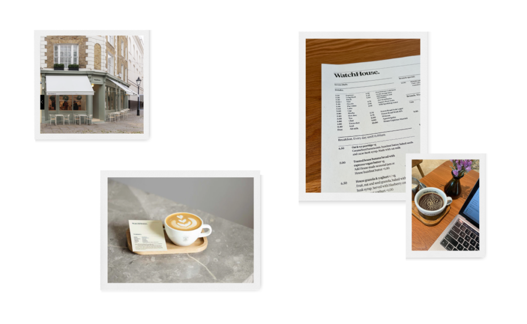
This café was right down the block from the hotel we were staying in, and I was drawn in originally for 2 reasons. The first was the simple and well designed storefront — they had a simple (but clearly designed!) logo, a sage green exterior, and white awnings. The second reason was that it was busy—always a good sign!—and had several people on laptops, which means they don’t mind if I plop down and work there for a bit.
Once I got inside, I loved how simple everything was while not feeling sterile. The menus were black and white, simple, and easy to read, while still using their unique brand font. The decor was mostly wooden with white walls, but every table had a bouquet of flowers. The coffee mugs had their tagline—Modern Coffee.—hidden on the inside, so that once you drink a bit, you’re reminded of it. Their packaged goods (mostly coffee and chocolate) were on display with beautiful, yet incredibly simple, packaging.
For me (and I’d guess for you, too), working in a place that is comfortable, tidy, and bright helps me to feel both calm and motivated. Which is why I came back again & again, and next time I’m in London, I’d be curious to check out their other locations!
The takeaway for your own branding:
When it comes to branding & design, sometimes SIMPLE is better. Sometimes I get client feedback to “make the logo bigger” or to fill in the empty space in a design with more STUFF. But empty space could be (and usually IS) a great thing. Busy isn’t better!

3. Pizzeria Mozza
The branding feels: Bright & fun.
Ok, I’ll admit. I’m a NYC pizza brat. I don’t usually eat pizza outside of my home city, because I’m typically left feeling disappointed. But when my dear friend (& fellow NYC pizza enthusiast) recommended Pizzeria Mozza in London, I knew I had to trust her & try it. This isn’t a food blog, so I won’t spend time telling you how good it was (but seriously, if you’re in London, go!)… but I DO want to talk about how amazing the experience was because of their branding.
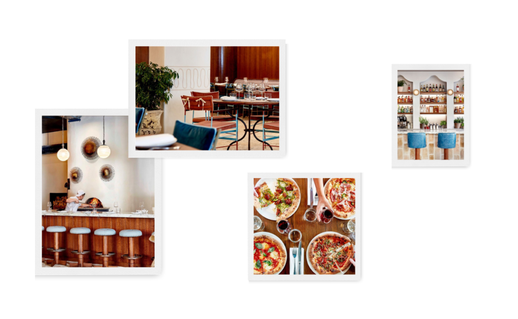
When I walked into Pizzeria Mozza, I was immediately happy to be there. The decor was just so gorgeous. There was lots of wood paneling, tables, & chairs which gave the place a homey, down to earth vibe. Fun light fixtures that made the place feel alive and fun without blinding you with brightness. Pops of turquoise on the chairs and bar stools. Funky wall accents, lots of plants… need I continue?
In addition to loving the interiors as soon as I walked into the place, they also offered me a seat at the pizza bar (I was dining solo because my husband was working late). Being able to get a front row seat to them making each pie from scratch was just so fun. And I love a restaurant that isn’t afraid to have their kitchen on full display—for me it builds a sense of trust, and shows me they take pride in their ingredients, process, and dishes.
The biggest thing with Pizzeria Mozza is that it wasn’t necessary the obvious branding elements that caught my eye. They have a logo, and I remember their menu being well designed too (although I don’t have a picture of it). But the entire brand experience made me enjoy my time there that much more, and be willing to go back again.
The takeaway for your own branding:
Branding isn’t just your logo or the obvious things—it’s the entire experience you provide for your clients/customers. If you have a brick & mortar store or sell physical products online, take great care in things like your interior design & your packaging. If you’re an online service-based business owner, provide an out-of-this-world client experience, and maybe consider sending a thoughtful gift when you start or end working together.
Branding—it matters. At Dishoom, it triggered a nostalgia factor and a sense of togetherness even among strangers. At WatchHouse, it drew me in while I was just walking down the street. At Pizzeria Mozza, it made me feel comfortable (& have a great time) dining alone.
And with all 3 of these examples, they reminded me of things we should all be doing with our own brands to help us stand out, build trust, foster brand loyalty, and grow in a way that feels authentic to us as small business owners.
Ready to take your brand to the next level so that you can create unforgettable experiences for your clients & customers? Head over to my Services page to get the rundown or just skip to the good stuff & book a free consult!
...at least I'm trying to make it that way. While I'm off Instagram, I'd love to hear from you in other ways! Fill out the form below with your thoughts or questions on the blog post!
Did ya hear? Website contact forms are the new Instagram DMs.
i'll write you back soon :)
Thank you so much for sending me your thoughts!