


So excited to share some behind-the-scenes of a branding and web design project I worked on for a fractional Chief Financial Officer and accountant.
I actually completed this project almost two years ago, but I’m finally dusting it off because I love how it came out. Liz was an absolute dream to work with, and I realized it hasn’t gotten the love it deserves on my site yet!
When Liz and I kicked off the project, her business was already wildly successful based on word of mouth and referrals alone. She didn’t yet have branding or a website—and while that’s an amazing place to be, she knew it was time to add a layer of legitimacy. She wanted a real home for those referrals to land, a stronger first impression, and an improved client experience through thoughtful, cohesive branding.
We started where I always love to start: brand strategy.
Brand strategy happens before any visual design work. It’s where we dig into everything from a business’s mission and vision to its values, audience, competition, and goals. This phase serves two important purposes:
- It helps me fully understand the business so I can create a strategic, intentional visual identity that resonates with the right audience and stands out from the crowd.
- And it helps the client gain clarity and confidence around their business—making it easier to make aligned decisions, whether that’s launching a new service or marketing themselves in a new way.
The Brand Strategy is a 30+ page PDF packed with nitty gritty details, but by the end of it, we land on a few key elements that guide the next phase: visual branding.
Some of the most important takeaways included:
- Brand positioning statement: ACCOUNTABLY supports service-based and e-commerce businesses with bookkeeping, accounting, and fractional CFO services rooted in collaboration and trust. By meeting clients where they are, ACCOUNTABLY delivers personalized financial guidance that helps business owners move forward with confidence.
- Audience: Service-based (B2B or B2C) and e-commerce business owners across the US, particularly in big cities like NYC, SF, and LA. Many are female professionals leaving the workforce or founders of VC-backed startups. They’re tech savvy, ambitious, curious, and always willing to learn and adapt.
- Brand vibes: Collaborative, minimal, feminine, flexible, clean, tech-forward, personalized, trustworthy, timeless
And here’s how the visual branding came together:
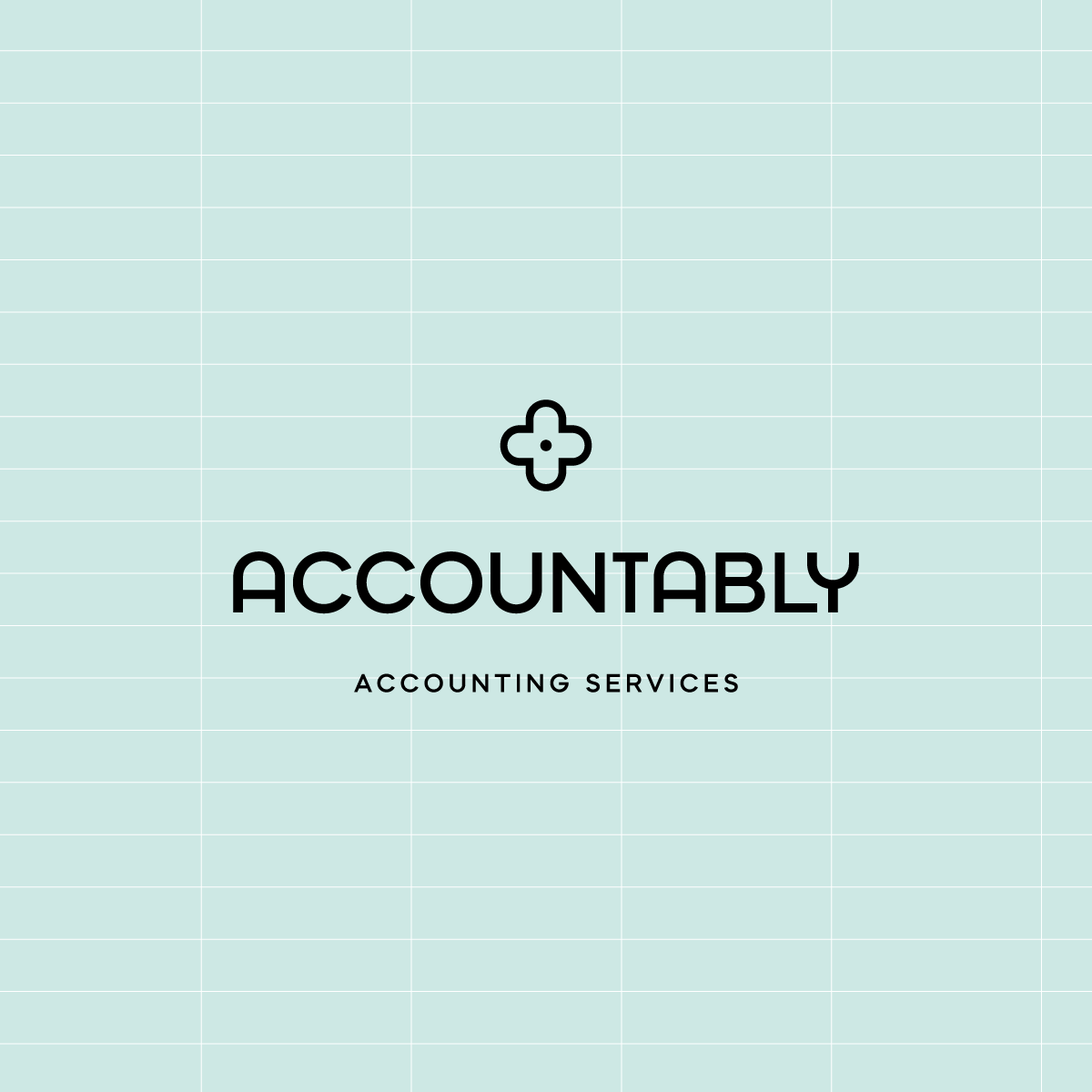
For ACCOUNTABLY’s logo, we chose a bold sans-serif typeface. One of the biggest strengths of Liz’s services is how flexible and personalized they are, so we leaned into that idea by customizing the wordmark itself.
I repeated the rounded curve of the “U” throughout the two “A”s and the “Y,” creating subtle movement and softness. These custom letterforms helped the logo feel both personal and warm—without sacrificing professionalism.
From there, I carried that same curved shape into the brand’s icon: a flower. The idea of growth came up often in our conversations, reflecting the way Liz helps her clients grow and strengthen their businesses through their finances. The floral motif also brought in a gentle, feminine touch that felt true to her brand.
You may also notice a grid background in some of the logo examples. This was a playful nod to spreadsheets—something accountants and CFOs live in daily—and a fun way to incorporate industry references in a clean, modern way.

ACCOUNTABLY’s color palette was designed to evoke trust while still embracing the brand’s uniqueness and femininity. While female founders weren’t Liz’s only audience, I loved her willingness to lean into that niche and trust that doing so would help her connect more deeply with the right people—without alienating others.

For the type system, we leaned into a fun, bubbly serif for headlines to add personality and warmth. Subheads and call-to-action buttons use the same font as the logo, creating cohesion across the brand, while the body copy sticks to a clean, easy-to-read serif to keep everything feeling polished and professional.

Always one of my favorite parts of any brand. While the logo system was intentionally clean and tech-forward, we had a lot of fun leaning into a hand-drawn style for the illustrations. These added personality and gave us space to reference Liz’s interests outside of her business—like her love of music—making the brand feel more human and well-rounded.
Overall, it was such a joy to work with Liz and even a couple years after creating this brand I am totally in love with it! Ready to take your own brand to the next level? Schedule a free consult call with me to chat more.
...at least I'm trying to make it that way. While I'm off Instagram, I'd love to hear from you in other ways! Fill out the form below with your thoughts or questions on the blog post!
Did ya hear? Website contact forms are the new Instagram DMs.
i'll write you back soon :)
Thank you so much for sending me your thoughts!